“It’s not who you are that holds you back, it’s who you think you are.” -Unknown-
Who Do You Think You Are?
Leave a reply

“It’s not who you are that holds you back, it’s who you think you are.” -Unknown-
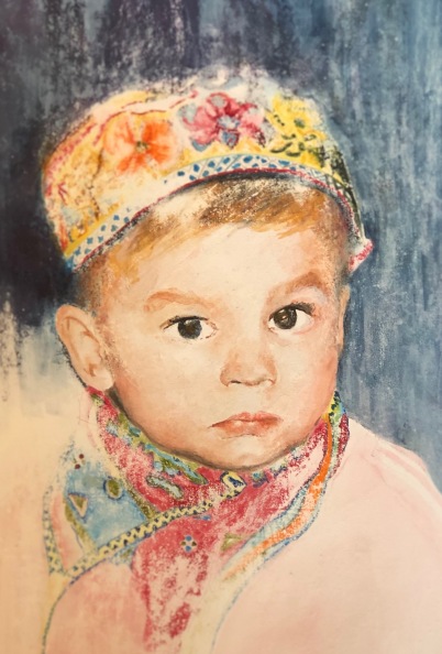
The following is a painting of my son Jakob when he was about two years old. It’s watercolor on canvas primed with limewash, which is pretty much the equivalent of a wall, that painters in the old days would have used to paint Frescos. I will explain the process in my next post. It was an interesting and fascinating experience and I am really happy with the result. Hope you like it too. Be safe, stay healthy, keep creating, xoxo, Lilo
Words of wisdom from a great thinker…
Quick follow up on yesterday’s post about different undergrounds for watercolor painting. I already showed you a little painting on Gesso board. The following is painted on traditional canvas primed with Gesso. You can buy it like this in any art store. I put the label in the picture, so you can see what exactly it’s called.
 It’s available in all kinds of sizes, different qualities and from several companies. I actually chose the cheapest I could find, I simply wanted to see what happens when I paint with watercolor on Gesso canvas. I might try different qualities in the future, we’ll see if it makes a big difference. This particular Gesso canvas did not suck up the watercolor as readily, the paint stayed on the surface for a while. Once dry though you can carefully add a second layer. It does have the tendency to lift the previous layer to a degree when applying the next one, so, it does take a little practice and patience. The upside is, that you can fairly easily correct mistakes, it’s easy to lift the paint, even once it’s dry, simply use a moist brush. Also, creating colors by layering was a bit of a challenge, but it is possible to a degree. In this picture, I used Cadmium Yellow, Permanent Alizarin Crimson and Indigo Blue. Some I mixed on the pallet, some on the canvas. I’m particularly happy with the hat and the folds on the shirt. Some parts of the skin turned out a little too green. Overall though, it was a good learning experience. A definite upside of canvas is the weight, which allows for very large sizes, and which inspired me to search for a canvas that can be used for watercolor. I have experimented with other types of primer and underground, stayed tuned for more on this subject in my next post.
I hope, wherever you are, the weather is as sunny as it is here today and you are safe and healthy. Stay curious, keep creating. xoxo, Lilo 😘
Commonly watercolor paintings are done on watercolor paper. If you want to display the painting and hang it on the wall, it usually is framed behind glass. That has two downsides, it’s costly and because of the weight, it limits the size. So I did some research on what else I could use to paint on. Obviously, there is canvas, but as far as I knew it usually was not used for watercolor, rather for oil and acrylic paints. After having consulted with a very knowledgeable salesperson at my art store, I came up with three options:
1) Most canvases are already primed with Gesso. He thought it was worth a try to just use it as is and see how it works with watercolor. I did, however, buy a Gesso board, wanted to try that first.
2) I found a watercolor ground (Schmincke, Daniel Smith, several companies make it), that can be painted on pretty much any surface. Once dry you can paint on it.
3) I also found a canvas especially made for watercolor. It is produced in Berlin, Germany. So, possibly you might not find it as easily in other countries, I am not sure. However, I would never want to use it again. I thought it was the worst option of the three. Obviously, that is only my opinion. You might want to find out for yourself. I was just not happy with the quality.
In order to test those three options, I painted a little bird.

From left to right: Gesso board with three layers of Aqua Ground, then in the middle simply Gesso board (as bought in the store), on the right the above mentioned watercolor canvas, which is really rather paper, not traditional canvas. Note the different quality of the brush stroke, the way the paint spreads, the quality of the layering and the way the paint flows into other colors – or not. As I said, the worst underground was the watercolor canvas (according to the company, it is their new invention, specifically made for watercolor painting). I wasn’t even able to add the watery layers I did on the feet in the other pictures. It simply would not work, the “canvas” would not take the color or let the color flow. If you look really closely, you can see a very faint spot around the feet of the bird. I also don’t like how the paint smudges. The other two undergrounds were fairly similar. The Aqua Ground allowed for a little more blooming. It was a very interesting experiment. Goes to show, how important good material/underground is. It can impact the quality of the painting quite severely. Note, I painted all three birds within a few hours, meaning there was no time for my painting skills to improve. The difference in quality is completely due to the ground I painted on. It was quite a revelation to me.
I experimented with other options to paint on. I will show you in the next post.
Hope you found this helpful. Keep painting. Stay healthy. Be well. 👩🏼🎨 😘
Today, tips on watercolor palettes – or things that can be used as one. 😉
I used to keep my watercolors in a John Pike palette. It’s very sturdy, holds a lot of different colors and has a lid that closes tightly, which makes it easy to take with you.
The downside is that the material stains, I never really liked that. So, I looked for alternatives.

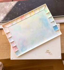
And I found this little beauty. It’s a ceramic mixing tray. Obviously, it has no lid, so, it’s rather for use at home. What I like is that the trays are quite deep, so you can add a lot of water. It’s ideal for mixing various shades (very handy when you paint monochromatic pictures). The one in the picture is 7 inches wide, it comes in different sizes. BTW, the brush is from Cheap Joe’s. They have excellent watercolor brushes (their own brand), that are inexpensive, hold a good portion of water and are very accurate.

While the ceramic tray is a really nice option. This is my absolute favorite. Simple white tiles, high gloss. The size is roughly 8 x 10 inches or 20 x 25 cm. Obviously you can choose whatever size you like. For my purposes this size seems ideal. I love love love it!
It’s ideal for mixing colors and trying out shades (less paper wasted). They are inexpensive and when you’re done you simply wash them with water and they are like new. I bought a whole box at my local home improvement store. Or, may be you have a couple of tiles left over from your last remodelling project. Try it, it’s truly fabulous. 😃
I just found this in my old drawings. It’s a gesture drawing, took only about two minutes. I really like it for its loose movement. It has energy and rhythm. Amazing what can be caught in a moment’s time when one is being present and just observing and drawing instead of thinking. 😉
Rhythm | Graphite on Paper | 2013

As mentioned in a previous post, I picked up watercolour painting again. It’s been a few years since I tried my hand at it. This time, I promised myself, I wanted to approach it in a very structured way, from the ground up. A teacher of mine once told me (watercolour-) painting is 80% preparation and 20% painting. Quite possibly that’s one of the reasons for my past frustration with watercolour. I used to just go at it, without lots of thinking. 😬
Not anymore! Here we go. One of the first steps, and a very helpful one, I might add, is creating your own colour swatches. Not only do they provide an overview of the shades you can create with a colour, you also learn (or practice) shading. Here is what you have to do.
Draw ten boxes in a row (with a pencil), even in size. Write the name of the colour above the row of boxes. Now, start colouring. The darkest shade first, then gradually get lighter until the very finest shade. The result should look somewhat like this:

If you really want to challenge yourself and practice some more, do it in reverse as well. Like this:
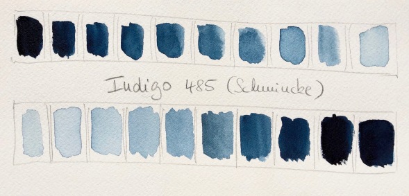
Do this for each of your watercolours. As mentioned, it is an opportunity to practice. Shading is not as easy as it might seem, and I noticed, that depending on the intensity of the shade the colour changed in ways that I did not expect. It’s really helpful to have the swatches. Next time when you try to decide which colour to use and/or which shade would be appropriate, they’ll come in handy. Believe me, been there, done that – oh, all the mistakes I made without them. But, I am learning. 😉 😀 I enjoyed that exercise. Hope you do too.
I guess Corona has caught up to all of us in one or the other way. Life becomes more and more restricted in order to prevent the virus from spreading. I, myself, have two families in my social circles that have been in direct contact with infected people, and are quarantined now. Consequently, I put myself on “house arrest“ until we know more. I have no symptoms, but it’s the reasonable thing to do.
It’s not all bad, gives me some extra time to paint, read and write. And, thanks to this little invention called internet I can stay in touch and share it with you. So, I am sending best wishes to all of you out there. Take care – and don’t freak out (honestly, who needs toilet paper for the next five years).
This will blow over, just hang in there. Meanwhile, with the right precautions for safety 😷 we can still help each other where needed, and most of all, be nice to each other. Now, more than ever, we need to know that we are not alone.
Sending lots of good wishes and xoxo. 😘
Käthe Kollwitz (1867-1945) was a German artist. She lived through both world wars, lost her brother and her younger son in WWI and her grand son in WWII. Needless to say that these losses left a great impression on her. She was a committed socialist and pacifist. Quite often she depicted death, hunger, and the devastation of war in her art. She mostly sculpted but also produced very impressive drawings. Her sculptures are outstanding, very special and among my favorites. I had the pleasure to see (and touch – a very special treat) some of her super large sculptures in the Käthe Kollwitz Museum in Berlin. A friend who visited this museum very recently sent me a postcard featuring one of her drawings called “Mother with Boy”. Kollwitz very often made the Mother a central figure of her art. Mothers who give birth to their sons, only to lose them in horrible senseless wars.
I’m so impressed with the seemingly simple style of her art, and I wanted to study her technique. Turns out, it might look simple but it has a lot of little intricacies that are harder to reproduce than it seems. I find, the best way is really to copy and experience how the artist did it. When I say copy, I mean looking and drawing free hand – no cheating with any helpful tools like rulers or so. The point is to train your eye and to get a sense for the technique of the artist.
Why is this line exactly here and not there? What happens if I move it just a bit? Is this little dot of importance? Those were the thoughts that crossed my mind while trying to copy her drawing. Again, it looks so simple at first sight, but it was actually really hard to copy. It helps when I step away for a few hours or even a day or two. It also helps, when I look at a photo of her and my drawing side by side (as you see below). For some reason I notice other things when I look at a photo instead of the actual drawing. And every time I see another little thing that needs “fixing”.
An amazing exercise, that I enjoyed immensely. I stopped at some point. It can still be improved. However, that is also a lesson I learned from this exercise. You stop at some point and accept the result. And then start over, if you wish. Every time you learn something new. Try it !

Here's To Express.. :)
Melancholisch-sarkastische Literatur für Schwarzhumoriker, Musikenthusiasten und andere glückliche Menschen.
Discovering the joy of art
An Art network About Sculpture in Today's Modern World
Flash Storms of Art for the Visually Addicted
Original Oil Paintings And Drawings By Sergey Gusev
Wanderings & Observations
Seat weaving and wicker repair
Bringing Awareness, News, Education, Community FB Forums, & Discussion for PCS Through Blogs & Podcasting...
Lunch Wrapping Art
Indulge- Travel, Adventure, & New Experiences
